Monday 31 October 2011

Artist Study - Akihiko Yoshida

Akihiko Yoshida is going back to when i did studies on another of Final Fantasys artists Tetsuya Nomura, FF has always been a major part of my life and i am happy to go back to studying some of the games main concept artists, here is some of FF12s artwork done by Akihiko Yoshida and some i just found online probably originating from Akihiko Yoshida also.


This kind of work is good for me to study because i want to learn how to show how metal armour and materials look and reflect in different light, it also shows body proportions, perspective and good use of colour, the amount of detail in these images is mind blowing and simply amazing, but i do like the way the light reacts with the characters as my main point of focus in these images.


Artist Study - Jinx

I found some really cool images on DeviantArt showing body proportion and took a few images to post on this blog as study, they are useful to me because i am always trying to better myself when it comes to body and hunan proportions and the way the artist has done it in their own work is good in my opinion. Also the simplicity and elegance of colours in the second image is something i would like to try and capture in my own work and this picture is a good source of reference to me. The only problem is that i tried the link i had taken to get more information on the artist but it doesnt seem to work and i tried looking for the artist again on DeviantArt but couldnt seem to find them again, this is their work though and i like it :P.


                                                                     jinx-star.webloc

Graffiti art lecture

Here are the notes i took in the graffiti art lecture.

http://www.youtube.com/watch?v=YPWbnuNXqD0&feature=player_embedded

This is the Corsa ad shown in the lecture showing how graffiti art has been modernised and used in popular society and to market products. I cant post the actual video here so there is the link to youtube.

The main points of the lecture for me are taken in the notes i did at the time.


The most notable part of the lecture for me was when the game Jetset Radio came up in the context of graffiti being used in games. I remember when i used to play the game that the graffiti had a very unique and loud style about it, i also knew that because it is a game that the source of art and graffiti used within the game must have been taken for another source namely real life. This as a point made me start to think that some graffiti is cool and that like in the game the police which try to stop you from expressing yourself with graffiti were bad and thinking back it is quite surprising how a game and its artwork can have such an impact of the players view of things.


Here is a little bit of game art of Jetset Radio, instantly looking at the colours used and the style of drawing you can see the kind of graffiti look coming out.


Graffiti art to me has always been a double edged blade when thinking about 'is it good or not?' because when it is used by an intelligent individual like Banksy rather than a gang of kids then yes of corse it is because it has meaning and a message to people, but when it is used for gangs to mark their turf or to vandalise bus stops then no because what use or gain is it to anyone. So to me Graffiti art will always be a style i can respect as being technically challenging but only when used in the correct context.

A3 Rendered Perspective Background

This is one of my most recent photoshop illustrations, i had very limited time when producing this so i am not as happy with the result as i could have been. With more time though i am confident i could have produced a more detailed more colour balanced image using the skills i have learned over the create module.

Monday 24 October 2011

Characters Face and Additional Poses

I was told after my presentation crit that i didnt have any work on my characters face, i suddenly realised wait i dont have any work on my characters face. Faces have always been a problem for me to draw unless i plain copy them so i decided to take the 25 facial expressions test, well 5 or 6 of them at least, this is what i produced. I also based my character around the facial features of Sean Bean as he has always been one of my favourite actors and characters in films. This also ties in with my Artist study on Game of Thrones as Sean Bean plays Lord Eddard Stark a king in the series and he has the elements and lives in the cold environment which i think my character could easily relate to.

I have also put up a few of my extra sketches which may add to the feel of the character in the way he stands or kneels, they are very basic as i have not worked any further on them than pencil and scanning in.


Thursday 20 October 2011

Artist study - Game of thrones

After my presentation crit i was told that my concept artwork with my character in his background reminded someone of the prison from the series game of thrones, i thought about it and yes it is much like it so i decided to post a few pictures which are artwork from the series and fit in well with the feel of my characters world and environment. I also based my characters facial features on the main character in the series Eddard Stark (Sean Bean) 


A good depiction of the character in a cold environment, would have been good to produce some work with my character in the same position/situation.


A landscape picture that can be seen to be like the work i have done on landscape for my characters environment.


Some very good line art that i would like to have a go at doing with my own environment. It was done by the production company: Elastic and the Director of the animation at the start of the series episodes Angus Wall. This is a link to the amazing digital introduction to Game of Thrones.

http://www.youtube.com/watch?v=s7L2PVdrb_8


Some artwork of the prison from one of the episodes, this is much like my character and environment i have done in my final piece, i like that it is coincidentally similar as i am a fan of Game of Thrones and would enjoy transitioning into creating art from the series to do with work i am producing for my Uni modules.

Artist Study - Angelicdevil

I have included this artist study as a completely new kind of art i find interesting, the artist known as Angelicdevil from deviantart uses texture and 3D imaging combined with good use of light and detail to create her images, i particularly like them for the sense of wilderness, the forests and the mountains and finally the sheer size and depth of the images have.


This artists work tends to look more real than some digital photoshop base created work i also like because they are done using already taken photographs which fooled me for a while when i thought they were completely manually drawn.


I love the silhouette and colour in the last image, the water could be blended into the sand a little better but other than that it is that well done it could be mistaken for a real life photograph. I think i have progressed a short way to producing images like this one when i had my photoshop induction and had to create a landscape but sill have a way to go to get images of this quality.

00AngelicDevil00.webloc

browse.deviantart.com/gameart/#/d4bzzat.webloc

Environment Perspective Remastered

Ive been working on my perspective drawing and decided to repost an old pic i did then some new ones ive done with a little more practice, it works well showing the improvement i have made while practicing  perspective drawing.


This is the image i have decided to render to meet the A3 rendered image criteria, i think it will work best because of the angle at which i captured the character in.


In the above image i again found myself trying to shade the picture instead of just leaving it as line art, i think i need to work on this but im happy with image anyway :) .


The above and below images are quick sketches mainly to show what i have learned about perspective drawing, i am happy to say i am sure i have improved since the initial sketches (top image) i did and will continue to use what i have learned in the future.


Artist Study - Aeonsend + Jer Mohler

I decided to blog about this artist because they were the number 1 winner for the gears of war concept art competition, they won $10,000 for this piece and the artist said it took them hours upon hours which i think means around 20-30 hours worth of work. It is also a good example of light / dark shading and awesome digital concept work with is all things i am interested in and would help me improve myself in these fields.


Aeonsend.webloc

today.deviantart.com/dds/#/d4b15g8.webloc

The Artist that won third place in the same competition was Jer Mohler and i have decided to add this person to my studies because they have a unique style that won them 3rd place and grabbed my attention, i have never tried this comic book style of art but still respect the skill and dedication that comes with producing the quality of art.


jermohler.deviantart.com/.webloc

Flip Book Finally

My first digital animation. I have made flip books in the past which is why this one probably seems to be stick man orientated but this is the first time i have had to put muscles and armour on any flip book character so it was a new challenge to me, i now fully appreciate how long and how much effort it takes to make even a 2 second long animation which is what this one is.


These are my sketches in illustrator of the storyboard for my animation, the above one is a very quick stick man sketch of what i intended to happen and below is a more defined 3 images which show key points in the sequence. I found out the above storyboard would have taken way too much time and would exceed the amount of pages we were given to work with so i shortened it and thats where i got the 3 images below from, which i think narrate the animation well.


Artist Study - El-Grimlock

El-Grimlock is the nickname of an artist i found on Deviant Art (which i just created an account on) he is in my opinion not as highly skilled as some artists work i normally look at but that is also a reason why i chose him to study, his work relates directly to mine in the sense that a lot of it is dragon and fantasy and i just really like the reds in the top image and the backgrounds he has used to highlight the character in the foreground. 


The bottom image is a favourite as well as it is not particularly well detailed but the feel and message of the image comes across clearly and i think some of my concept art has the same elements to it as this.


el-grimlock.deviantart.com/.webloc

Finished T-Shapes

These are the all round sketches of my character in the T-shape position showing proportions, scale and the general size and shape of the characters armour. I did the front pose a while before i did the other two poses which is why they may seem to change in style a little bit as i put more time into the side and back positions, the side position in particular captures the shape and texture of my characters armour which i am happy with.


This is a go at rendering in colour i did on the front pose T shape, i has worked quite well but not as much as i would have liked it to. I again went for the typical red armour which is associated with dragons and fire.


Tuesday 18 October 2011

Artist Study - Baron Tieri

These images are the work of Baron Tieri i found this artist again on fuck yeah concept art and decided to add him to my artist studies because i really like his perspective work shown in the top image and how you can tell the angle at which the camera is at and how there is a great sense of perspective, it is perticularly relevent to me at the moment because i have been working on my perspective drawing and is a good source of reference to keep in mind.

The image below is particularly useful as a study because at the moment i am working on improving my perspective work so i have used this image as reference.


This is a good character + landscape artwork that relates to my work as i have a similar idea in mind for a final piece.


More stunning character artwork.


barontieri.com/.webloc

Post Modernism

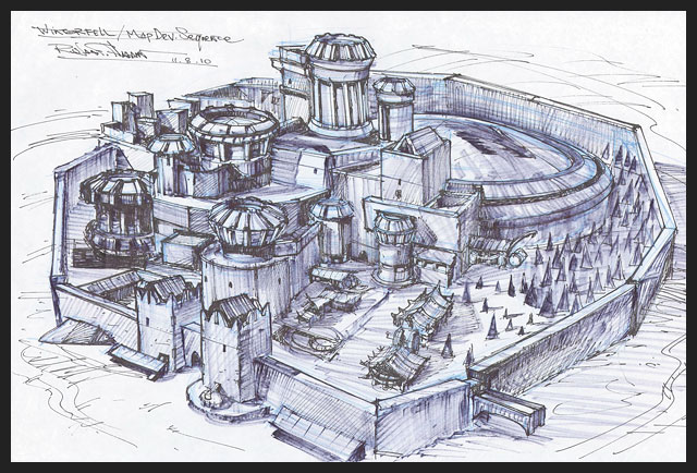
These are my notes on the Post Modern lecture.

The way i understand post modernism is, it tries to do everything opposite to Modernism, it came straight after or as a response to modernism, it is less serious and initially born from optimism, it questioned things that were not meant to or were not usually questioned it gave truth to materials (one of the big factors of post modernism and of the current day) and form over function, it created new art styles as technology progressed enough to allow new art styles to be explored and created.                                                        
I like to think that i understand Post Modernism as much as anyone thinks they can understand it in its catagorised form but there are still thrologists who disagree on key points of Post Modernism like when it started or has it even actually ended so i have accepted that this movment is and probably always will be above mine along with manys comprehention, there is also a disillusionment in Post Modernism with the idea of absolute knowledge and a search for Utopia within the chaos, this all again supports the fact Post Modernism will always be above manys comprehention, but what i can do is understand where the roots of modern film and games have come from and how things today relate and are undeniably influenced by things that have happened in the Post Modern art movment.

Post Modernism has also been described by Fredrick Jameson - Post Modernism is bottomless, empty, recycling with no investment. I have to agree with this statment as looking at several artists work like Piero Manzoni and David Shringley it appears to me at least that the artists work have no other meaning than to suprise people and while that can be considered an interesting for of art in itself it does not appeal to me as an artist.

There is also this idea of a Post Modern dystopia where technology and information overload will create a world like that which is portrayed in the film Bladerunner, Star Wars also springs to mind, this idea fits in with the summary of Post Modernism which was described to us. My summarising Post Modernism notes - Mix the highbrow and the populist, mixing the accessable and the unaccessable, and to sample elements from different styles + eras. Pick n mix your way through the gawdy fragments of a shattered culture.

This brings me onto again why this relates to me. Well

Artist Study - Mark Molnar

I came across the concept artist Mark Molnar recently who creates work in photoshop of a quality which i want to aspire to, as seen in the image below it looks like he uses quick brushstrokes which gives the image a certain style as well as giving the feel of movement which i really like and try to mirror in my own work, he also has a good style of colour in his images as shown in both landscapes pictures below with the relatively limited amount but very good use of colour in the top image and the varying deep dark and light greens in the bottom image and he finishes the compositions with a depth feel by draining or subtracting from the colour for the far away or distant parts of the images to gives it the illusion of distance which he does expertly. Also the varying amounts of detail in the top image is a very subtle but key factor in making the image impressive, the detail on the castle to the left automatically brings the focus of the viewer there and away from the horde outside the castle which being not highly detailed is a good factor in itself because it adds to the impression that it is a rabble, a horde, a cluster of soldiers which may even bring into consideration psychologically which side is good and which side is bad, detail - order - light - straight lines generally = Good, opposed to the dark - curves - clustered - rabble which generally = Bad. In these ways the images is expertly portrayed and is why i as a concept artist like this artists work.


markmolnar.com/home.webloc

Thursday 13 October 2011

Photography Lesson 2

This is the new stuff i learned to do with a camera.


Trying here to get my model in a pose i could use for concept artwork. Also using a lightbox workspace that is typically used for presenting items that would be sold.


Another perspective and depth of field study.


Again i am posing my self for an idea of concept art. I used the only one of the lamps without the soft light cover from one direction to give myself more dynamic shadows on one side. This is also the pose i used in my character/background composition on photoshop.


The final and one of my favourite tests was the 15 second low aperture exposure shot using the neon lights. this picture was taken over 15 seconds while i moved a light around behind the model and it has a pretty cool end effect.